Overview:
Constant Contact is an online marketing platform which helps small businesses and non-profit organizations grow by providing tools to maintain their existing customers and grow their user base.
Problem:
Organizations need an efficient way to complete and manage their email marketing campaign process within the Constant Contact Platform.
Solution:
Improve the usability of the task flow by ensuring consistency, improved efficiency, and modernizing the user interface to increase overall user satisfaction.
Our redesign successfully improved the overall usability by:
Reducing the number of clicks by 25%
Reducing the time to complete the task flow by 73%
Increasing overall user satisfaction rate from 75% to 83%
Demo of Constant Contact Redesign:
Process:
Research Methods:
Competitive analysis to determine how Constant Contact compares to their competitors.
Interviews with marketers to understand how they use and manage their email marketing campaigns and to determine their needs and wants within the platforms they use.
Contextual inquiries with marketers and non-marketers to help identify pain points within the existing task flow.
Heuristics Evaluation to address any usability problems regarding the UI design.
Insights:
1. All marketers track their email performance metrics.
This statistic informed our design decision to implement a snapshot of users most recent metrics.
2. Open rate and click-through rate are the most valued metrics by marketers.
our decision regarding which type of metrics to display within the snapshot for the dashboard was influenced by this finding.
3. Experienced marketers strategically schedule their marketing campaigns to be sent at a specific date and time.
The results determined the information architecture for scheduling an email.
Existing Pain Points:
1. The dashboard layout is confusing and initiating the campaign process wasn’t clear to users.
2. The template selection process is overwhelming and lacks organization.
3. Adding recipients to schedule a campaign is inefficient because users cannot add any additional emails or edit existing lists on this page.
4. Users were overall dissatisfied with the platform.
“The user interface is outdated and clunky.”
“There is no progress indicator throughout the task flow.”
“Compared to competitors, the platform is impersonal.”
Personas:
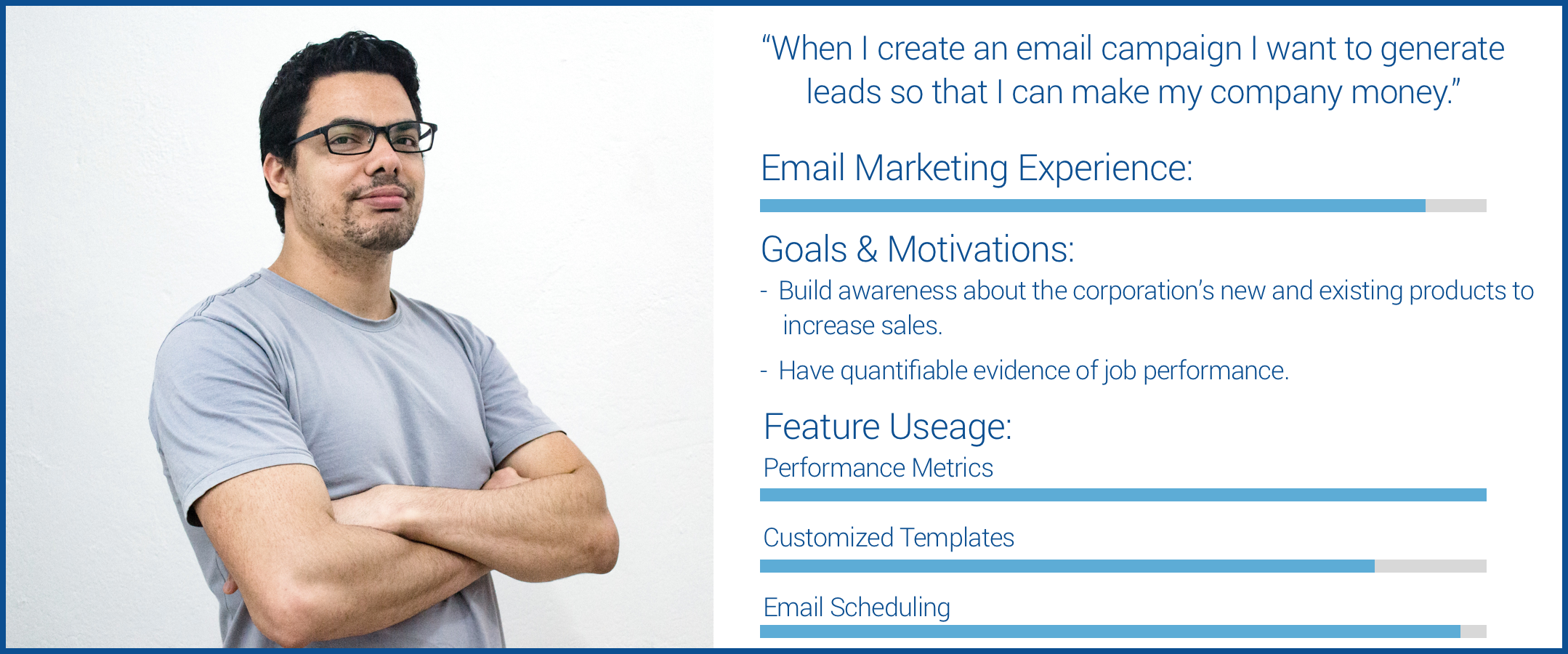
Based on our research findings we developed 2 archetypes that represent the most common Constant Contact user demographics.
The Experienced Marketing Professional
The Small Business Entrepreneur
KPI’s:
Reduced time to create & send an e-mail
Reduced number of clicks
Increased UI satisfaction
Overall increased user satisfaction
User Flow:
Our research determined the only issue with the existing user flow is that user’s cannot edit their email recipient lists. This was the only change made to the revised user flow.
Additions:
Progress bar throughout the task flow to illustrate the number of steps to complete an email campaign.
Page titles for each page to provide users with clarity regarding their location.
Dashboard analytics, the most important metric to CC users.
Categorized templates for improved organization and scan-ability.
Personalization elements including welcome messages and a humanized chatbot.
Modernize UI task flow with thinner icons, clean navigation, and increased white space.
Revised information architecture based on user needs and preferences.
Lo-Fi Wireframes:
Usability Testing:
Learnability tests
Moderated in-person tests
Problem discovery tests
Iterations:
1. Template Selection Process:
Highlighted ‘Your Templates’ because this is the most frequently used category by Constant Contact’s primary user group. We also increased the difference in size between templates and template category icons so users would know they are different elements.
2. Progress Bar:
Since marketers conduct several email campaigns using the same process they didn’t feel the need to have a detailed progress bar. Users preferred to have something that would indicate their progress without having distracting content.
3. Navigation:
Users preferred the white navigation background because it was easier to read and appears more modern.
4. Chatbot:
Changed the original chatbot to allow users to view all assistance options immediately since Constant Contact differentiates themselves from their competitors by providing exceptional customer service options.


